“The love of complexity without reductionism makes art; the love of complexity with reductionism makes science.” — E.O. Wilson
In the 1950s William S. Burroughs popularized an art form called the “cut-up technique.” The idea was to take existing stories (in text, audio, or video) and cut them up into pieces, and then recombine them into something new. His creations are a juxaposition of (often disturbing) imagery, chosen to fit together despite coming from different sources. Here’s a sample from The Soft Machine:
Police files of the world spurt out in a blast of bone meal, garden tools and barbecue sets whistle through the air, skewer the spectators - crumpled cloth bodies through dead nitrous streets of an old film set - grey luminous flakes falling softly on Ewyork, Onolulu, Aris, Ome, Osteon - From siren towers the twanging notes of fear - Pan God of Panic piping blue notes through empty streets as the berserk time machine twisted a tornado of years and centuries-
The cut-ups aren’t always coherent in the sense of having an understandable plot - sometimes Burroughs was just aiming to convey an emotion. He attributed an almost mystical quality to cut-ups, saying they could help reveal the hidden meanings in text or even serve as prophecy, since “when you cut into the present the future leaks out.” His experimental film The Cut-Ups was predictably polarizing, with some people finding it mesmerizing and others demanding their money back.
If you jump through the video a bit you’ll see that it isn’t quite as repetitive as it seems during the first minute. (I also think Burroughs would heartily approve of jumping through the movie rather than watching it from beginning to end.)
This idea of combining parts to create something new is alive and well on the internet, especially now that we are starting to amass a huge library of video and audio clips. It’s painstaking work, but there is a whole genre of videos in which clips from public figures are put together to recreate or parody existing songs, or to create totally original compositions.
Since the whole can have a meaning that is more than the sum of its parts, our brains must be somehow putting these parts together. This process is referred to as “configural processing,” since understanding what we’re hearing or seeing requires looking not just at the parts but at their configuration. Work from Uri Hasson’s lab (before I joined as a postdoc) has looked at how meaning gets pieced together throughout a story, and found a network of brain regions that help join sentences together to understand a narrative. They used stimuli very similar to the cut-ups, in which sentences were cut out and then put back together in a random order, and showed that these brain regions stopped responding consistently when the overall meaning was taken away (even though the parts were the same).
Today I (along with my PhD advisors, Fei-Fei Li and Diane Beck) have a new paper out in Cerebral Cortex, titled Human-object interactions are more than the sum of their parts (free-access link). This paper looks at how things get combined across space (rather than time) in the visual system. We were looking specifically at images containing either a person, an object, or both, and tried to find brain regions where a meaningful human-object interaction looked different from just a sum of person plus object.
In the full paper we look at a number of different brain regions, but some of the most interesting results come from the superior temporal sulcus (an area right behind the top of your ears). This area couldn’t care less about objects by themselves, and doesn’t even care much about people if they aren’t doing anything. But as soon as we put the person and object together in a meaningful way, it starts paying attention, and we can make a better-than-chance guess about what action the person is performing (in the picture you’re currently looking at) just by reading your brain activity from this region. Our current theory about this region is that it is involved in understanding the actions and intentions of other people, as I described in a previous post.
Next month I’ll be presenting at CEMS 2016 on some new work I’ve been doing with Uri and Ken Norman, where I’m trying to figure out exactly which pieces of a story end up getting combined together and how these combined representations get stored into memory. Working with real stories (like movies and TV shows) is challenging as a scientist, since usually we like our stimuli to be very tightly controlled, but these kinds of creative, meaningful stimuli can give us a window into the most interesting functions of the brain.
Interviewer: In view of all this, what will happen to fiction in the next twenty-five years?
Burroughs: In the first place, I think there's going to be more and more merging of art and science. Scientists are already studying the creative process, and I think the whole line between art and science will break down and that scientists, I hope, will become more creative and writers more scientific. [...] Science will also discover for us how association blocks actually form.
Interviewer: Do you think this will destroy the magic?
Burroughs: Not at all. I would say it would enhance it.
The Amazing Race is one of the few reality TV shows that managed to survive the bubble of the early 2000s, with good reason. Rather than just trying to play up interpersonal dramas (though there is some of that too), it is set up like a traditional game show with a series of competitions between teams of two, who travel to different cities throughout the world over the course of the show. Eleven teams start out the race, and typically the last team to finish each day’s challenges gets booted from the show until only three teams are left. These three teams then have a final day of competition, with the winner being awarded $1 million.
Winning first place on any day before the last one doesn’t matter much (though you get a small prize and some bragging rights), which is interesting, since it means that it is possible for the winning team to have never come in first place before the final leg. This got me wondering: if we think of the Race as an experiment which is trying to identify the best team, how good is it? What if we just gave teams a point for every first place win, and then saw which one got the most points, like a baseball series?
Modeling the Race
To try to answer this question, I build a simple model of the Race. I assume that each team has some fixed skill level (sampled from a standard normal distribution), and then on each leg their performance is the sum of this instrinc skill and some randomness (sampled from another normal with varying width). So every leg, the ranking of the teams will be their true skill ranking, plus some randomness (and there can be a lot of randomness on the race). Fans of the show will know that this is a very simplified model of the race (the legs aren’t totally independent, the teams can strategically interfere with each other, etc.) but this captures the basic idea. I ran simulated races 10,000 times for each level of randomness.
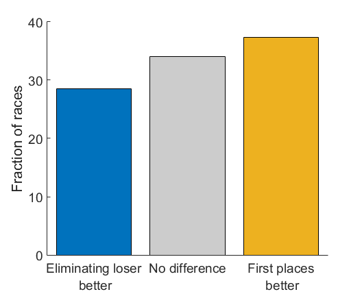
We can measure how effective the Race was at picking a winner, by seeing what true skill rank the winning team had. So if the team with the highest skill (number 1) wins, that means the race did a good job. If a team with a low skill rank (like 10) wins, then the race did a very bad job of picking the million-dollar winner. This plot shows the rank of the winning team, compared to chance ((1+11)/2=6).
This actually looks surprisingly good! Even at with lots of leg randomness (more than the actual skill difference between the teams) a team with a relatively high rank tends to win. Once the randomness gets to be an order of magnitude bigger than the differences between teams, the winner starts getting close to random.
Improving the Race
But how good is this relative to a simpler kind of competition, where the winner is the team with the most first-place wins? Rather than eliminating teams, all teams race all 9 legs, and the team coming in first the most wins the prize (ties are broken based on which team won most recently). Would this do better or worse?
Turns out this is a little bit better! In general the rank of the winning team tends to be higher, meaning that a “more deserving” team won the money. But the size of the gap depends on how much randomness there is in each leg of the race. Which point along these curves corresponds to the actual TV show?
To answer this, I took the per-leg rankings from the Amazing Race Wikia from the past 10 seasons. Yes, there are people way more obsessed with this show than me, who have been together databases of stats from each season. I measured how consistent the rankings were from each leg of the race. If there wasn’t any randomness, we’d expect these to have a perfect (Kendall) correlation, while if each leg is just craziness for all teams then the correlation should be near zero. I found that this correlation varied a bit across seasons, but had a mean of 0.0992. Comparing this to the same calculation from the model, this corresponds to a noise level of about sigma=2.2.
At this level of randomness, there is about a 10% advantage for counting-first-places competition: 37.4% of the time it picks a better team to win the money, while 28.5% of the time the current elimination setup picks a better team (they pick the same team 34.1% of the time).
Of course there are some disadvantages to counting first place wins: the requires all teams to run all legs (which is logistically difficult and means we get to know each team less) and the winner might be locked-in before the final leg (ruining the suspense of the grand finale they usually have set up for the final tasks). This is likely a general tradeoff in games like this, between being fair (making the right team more likely to win) and being exciting (keeping the winner more uncertain until the end). As a game show, The Amazing Race probably makes the right choice (entertainment over fairness) but for more serious matters (political debate performance?) maybe we should pay attention to the winner of each round rather than the loser.
All the MATLAB code and ranking data is available on my bitbucket.
The Big Data craze is in full swing within many scientific fields, especially neuroscience. Since we can’t hope to understand the tangled web of the brain by looking at only one tiny piece, groups have started to amass huge datasets describing brain function and connections. The idea is that, if we can get enough careful measurements all together, then we can have computers search for patterns that explain as much of the data as possible.
This approach would have made perfect sense to Tycho Brahe, a Danish astronomer born in 1546. Although people have been studying the skies since the dawn of civilization, Brahe was the first to make a detailed catalog of stellar and planetary positions.
Brahe was a towering figure. He ran a huge research program with a castlelike observatory, a NASA-like budget, and the finest instruments and best assistants money could buy. […] Harvard University historian Owen Gingerich often illustrates Brahe’s importance with a mid-17th-century compilation by Albert Curtius of all astronomical data gathered since antiquity: the great bulk of two millennia’s worth of data came from Brahe.
Brahe then announced a model of planetary motion that fit his vast dataset exactly. You could use it to predict precisely where the stars and planets would be in the sky tomorrow. It relied on a fancy prosthaphaeresis algorithm that allowed for the computation of a massive number of multiplications. The only problem was that it was deeply, fundamentally wrong.
It was called the Geoheliocentric Model, since it proposed that the sun orbited the stationary Earth and the other planets orbited the sun. It was attractive on philosophical, scientific, and intuitive grounds (of course the Earth isn’t moving, what could possibly power such a fast motion of such a heavy object?). And it illustrates a critical problem with the data-mining approach to science: just because you have a model that predicts a pattern doesn’t mean that the model corresponds to reality.
What might be needed is not just more data, or more precise data, but new hypotheses that drive the collection of entirely different types of data. It doesn’t mean that Big Data isn’t going to be part of the solution (most neuroimaging datasets have been laughably small so far), but simply performing pattern recognition on larger and larger datasets doesn’t guarantee that we’re getting closer to the truth. The geoheliocentric model was eventually brought down not with bigger datasets, but by a targeted experiment looking at small annual patterns of stellar motion.
Interestingly, there is a clear counterexample to my argument in the work of Dan Yamins, a postdoc with Jim DiCarlo. Dan has shown that a neural network model that learns to label objects in a large set of images ends up looking a lot like the visual processing regions of the brain (in terms of its functional properties). This is surprising, since you could imagine that there might be lots of other ways to understand images.
I wonder if this works because the brain is itself a Big Data mining machine, trained up through childhood to build models of our experiences. Then finding the strongest patterns in big datasets of experiences (images, videos, audio) might come up with the same solution as the brain. Or maybe our neural network models are starting to approximate the broad functional properties of the brain, which makes them a good hypothesis-driven model for finding patterns (rather than just blind data mining). As John Wixted stressed at the CEMS conference last week, hypothesis-free data anlysis has a seductive purity, but the true value of datasets (regardless of their size) comes only through the lens of carefully constructred ideas.
Doing great research is tough. There are so many factors outside of your control: experiments not panning out, unfair reviewers, competing labs, limited funding sources. I’ve tried to distill down some of the strategies that worked well for me and my labmates (these are most relevant to my background in science/engineering, but some might apply to other fields as well):
Get your hands dirty
Some early grad students get stuck in a loop of doing a lot of general talking about the kind of things they want to work on, but never really get started. Taking time to learn and plan your experiments is great, but there are a lot of things you can’t learn without diving into real data. You’re almost certainly going to mess things up the first one or two (or twenty) times, so start making mistakes as soon as possible. Having a deeper understanding of the data you’re dealing with will be invaluable in driving the kinds of questions you’ll ask and the design of your experiments.
Investigate things that don’t make sense
When you’re looking at the results of an analysis, often there will be something that just doesn’t quite line up: there’s one value of 1.01 when the maximum measurement should be 1, two data points are exactly on top of one another, 1% of the data points are giving “NaN”s. It’s easy to just brush these under the rug (“it’s just a couple datapoints”), but getting to the bottom of these is critical. Often they will reveal some flaw in your analysis that might mean all your results are invalid, or (if you’re lucky!) they might point to some new science hiding being an unexpected pattern in the data.
Explore, then replicate
The best way to approach an unfamiliar problem is to first collect (or extract from your full data) a pilot dataset, and start looking for patterns. You don’t need to be rigorous about statistics, multiple comparisons, or model complexity - what are the strongest signals you can find? Are there ways of transforming the data that make it more amenable to your models? Then, once you’ve optimized your analysis, you apply it to new (or held-out) data, and meticulously measure how well it performs. If you do your playing directly on the data, it’s very easy to start fooling yourself about what’s really there and what you just want to be there.
Realize that you’re in the big leagues
Throughout school, you’ve always been measured against your peers - your kindergarten macaroni crafts earned you a gold star because they were impressive for your experience level, not because they were competitive with a typical exhibit at the Louvre. In your first year of grad school, you are now competing with professional scientists who have been in the field for 40 years. This is intimidating (and one of the reasons why you start out being mentored by senior students and faculty members), but also exciting. You are on the front lines of scientific knowledge, answering real problems that no one has ever figured out before.
Know more than your advisor
This might sound contradictory to the previous point, since your advisor has a many-year head start in understanding your field, and you can’t hope to have more total knowledge by the end of your PhD. But for the particular project you’re working on, you should be finding papers on your own and reading everything you can. Publishing a paper that advances the field is going to require knowing more about that topic than anyone in the world, including your advisor.
Keep an end-of-the-day journal
Completing a PhD requires extremely long-term, self-guided planning, and it’s easy to lose track of what you should be working on and what the critical next steps are. Different people have different solutions for this, but my favorite strategy was to take 10 minutes at the end of the day and write (in a physical, dead-tree notebook) a couple bullet points about what I did that day and what the next steps should be. This forces you to take stock of your current goals, gives you a little morale boost (especially when you can look back over the past week and remind yourself that you really did make progress), and lets you pick up where you left off when you come back to your projects (possibly days later).
Drink Water
Taking care of your physical health is often the first thing to go when stress sets in, but this is a sure way to completely derail your research career. Drinking more water is an easy fix for most grad students - you can avoid kidney stones (I learned that the hard way), you’ll eat less junk, and having more bathroom breaks makes sure you take some breaks from your chair (no fitbit required). Some other no-brainers are to make sure you have an ergonomic typing setup (I know multiple PhDs that had to go on leave due to RSI) and keep a reasonable sleep schedule.
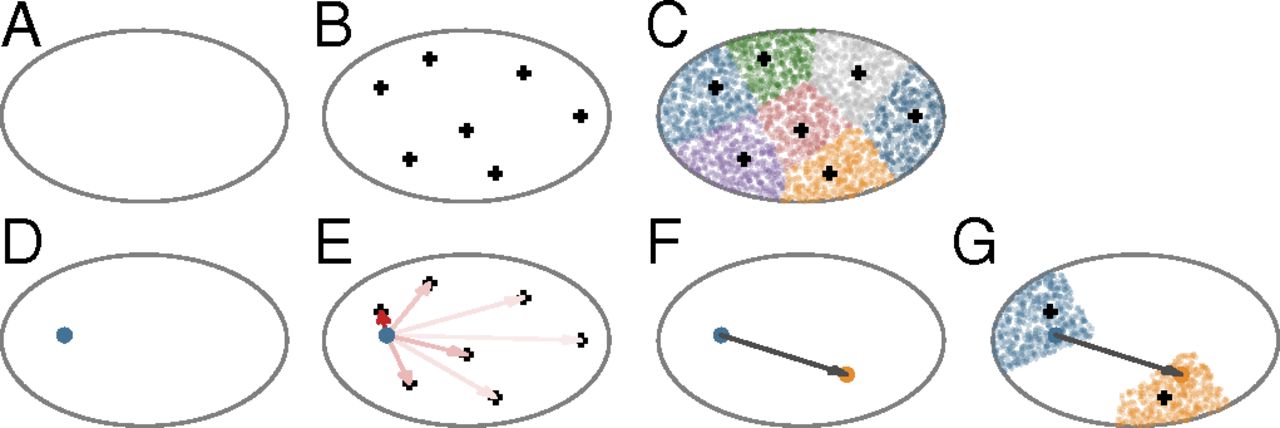
Today I had a chance to read a paper by Song, Kennedy, and Wang about their model for explaining how brains are wired up at a high level (explaining how areas are connected, not the detailed wiring of neural circuits). It’s very simple, but manages to capture some complicated aspects of brain structure.
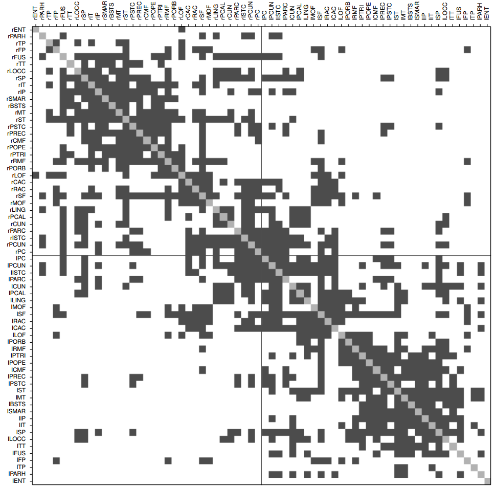
The goal of the model is to offer some explanation for area-to-area connection patterns across species (humans, monkeys, mice). For example, the human connection matrix looks like this (from their supplementary material):
Gray squares show pairs of regions that (we think) are connected to each other. This looks complicated, and it is - every region has a different connection pattern, some are similar to each other (neighboring rows), some are very dissimilar, some regions (rows) have lots of connections and others have few, etc. The Song et al. paper starts by discussing the features of these matrices that seem predictable and similar across species, but the part I found more exciting was their proposed model for how you would grow a brain with these properties.
This figure from their paper shows the setup. You first randomly choose a bunch of points as the centers of brain regions and randomly create a bunch of neurons, assigning each neuron to belong to the closest region center (A-C). Then, to grow a connection out from a neuron, you pick a direction as a weighted average of the directions to all region centers (with closer regions weighted more heavily), and then grow in that direction a random amount (with short connections more likely than long connections) (D-G). That’s it! Every neuron grows without talking to any other neuron, and they are not even really aiming anywhere in particular.
This simple set of instructions is enough to produce some of the structures in real connectivity matrices, like relationships between how similar the connections are for two regions and how likely they are to be connected to one another. One of the take-aways is that spatial position is a very important feature for wiring brain regions - just adding a bias to connect close regions rather than distant regions is enough to explain a lot of the brain data. This sounds sort of obvious, but spatial position is often ignored in many analysis methods, and I’ve been recently proposing ways of incorporating spatial information for understanding connectivity at both the whole-brain and region level.
There is a lot missing from this paper - it makes a literal “spherical cow” assumption that the brain is a solid ellipse, assumes that neurons are fired in straight lines like a laser, and doesn’t account for how brain size changes during development. But in some ways it makes the result even more impressive, since they can explain a lot of the data without using any of these details.